S&P at 7,400. Irrational Exuberance. The Last Two Times This Setup Held, the Index Halved.
Published: May 17, 2026
S&P 500 at 7,400. Irrational Exuberance even as the economy underneath is cracking. The last two times we saw this setup, the index halved.
2000 (Dot Com): -49% over 30 months. 2007 (Subprime): -57% over 17 months.
Apply that math to today and the S&P lands somewhere between 3,200 and 3,800.
Yes, Q1 earnings came in at 27.7% vs 13% estimate. AI capex heading to $1 trillion. The bull case is real. But the rally is carried by 10 stocks running 40% of the index, and the AI cash flow assumptions seem stretched.
Where we are now:
- CAPE at 39.6 - only the second time in 145 years
- Auto delinquencies past the 2008 GFC peak. Cards near it.
- U-6 unemployment back to pre-GFC 2007 levels
- PPI at a 25-year high ex-COVID
- Brent at $106. Gas at $4.50
Dimon: "too much exuberance"
Buffett sitting on $397B cash, calls this "gambling"
And the President's trading disclosures add a new risk angle.
Not a forecast. What the pattern produced last time. Twice.
I was in the markets both times.
tigzig.com · tremor.tigzig.com
Educational analysis. Not financial advice. See disclaimer in the note.
Irrational Exuberance - Full Note
Browse the slides or download the PDF
Full Deck Content (Text Format)
Text below was extracted from the source deck. Chart visuals stay in the PDF and as slide images above the post.
Tigzig Analysis Note - 17 May 2026
Extraordinary Popular Delusions and the Madness of Crowds
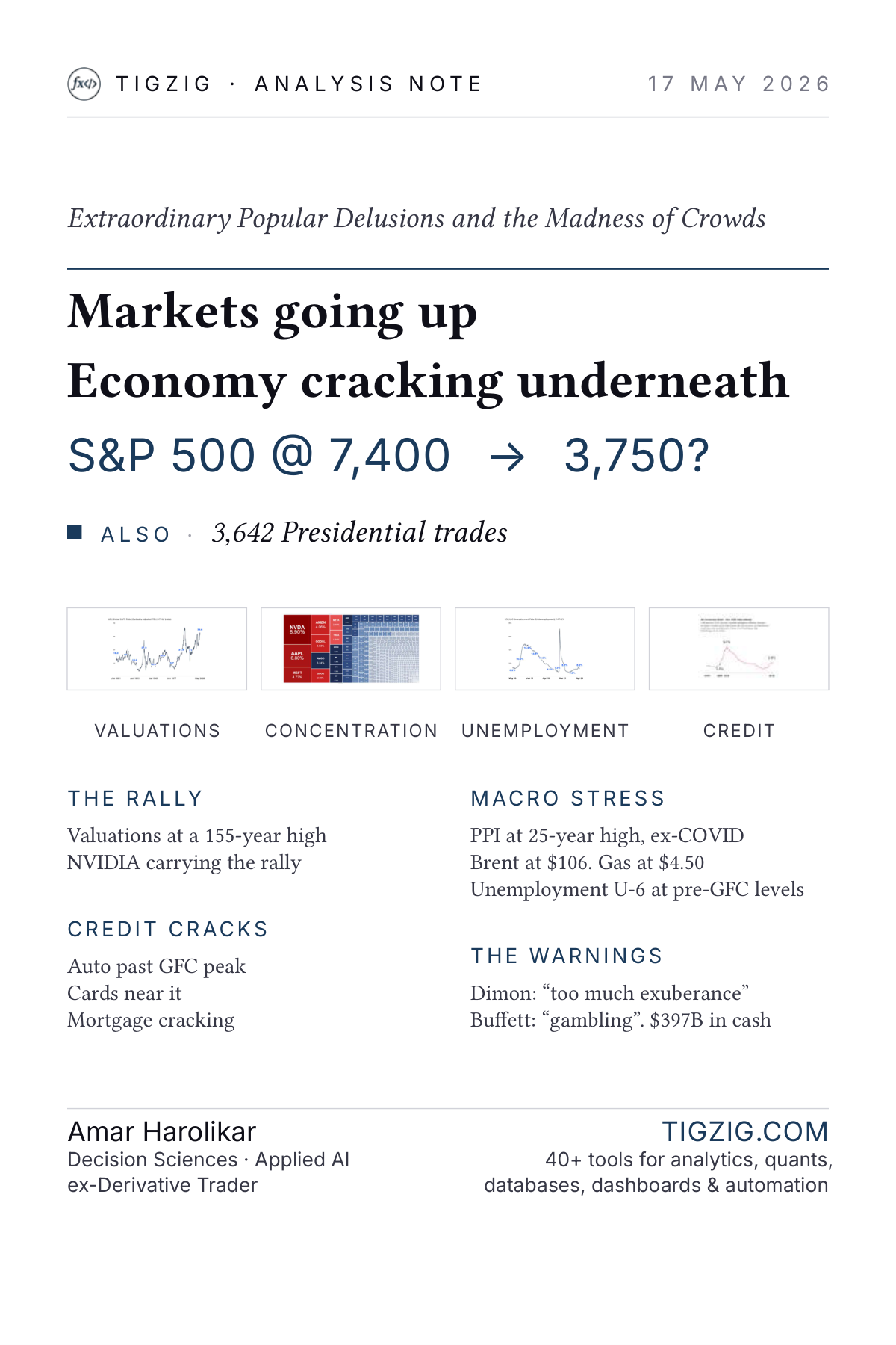
Markets going up. Economy cracking underneath. S&P 500 @ 7,400 - 3,750? The brief documents what the bull case leaves out: valuations at a 155-year high, NVIDIA carrying the rally, credit cracking across auto, cards, and mortgages, PPI at a 25-year ex-COVID high, Brent at $109 with gas at $4.50, U-6 unemployment at pre-GFC levels, 3,642 Presidential trades filed past deadline, and warnings on record from Jamie Dimon and Warren Buffett.
"Men, it has been well said, think in herds; it will be seen that they go mad in herds, while they only recover their senses slowly, and one by one."
CHARLES MACKAY - Extraordinary Popular Delusions and the Madness of Crowds, 1841
Where We Are
Two prior peaks. Each gave back roughly half. Today sits at the second-highest valuation in 145 years.
[S&P 500 daily chart, Jan 1995 to 15 May 2026. Peaks marked at Mar 2000 (1,527), Oct 2007 (1,565), and today (7,408).]
The 2000 and 2007 peaks each preceded roughly a 50% drawdown in the index. Today's print of 7,408 sits at the second-highest CAPE valuation in 145 years. The rest of this brief lays out what stacks behind that number.
Source: S&P 500 daily close (Jan 1995 to 15 May 2026), via Tigzig TREMOR Platform
The Bull Case
The bull case isn't crazy. It just isn't the whole picture.
Q1 2026 S&P 500 earnings growth came in at 27.7% against an analyst consensus of 13.0% - more than double the estimate, and the highest blended growth rate since Q4 2021. Earnings, on the face of it, are strong.
27.7% - actual 13.0% - estimate
The case extends past earnings to two structural claims:
- The US economy is far less oil-dependent than in past cycles - but gasoline at $4.50 a gallon, up 53% from pre-war levels, says otherwise.
- AI capital expenditure could top $1 trillion in 2027, roughly 3% of US GDP - but the cash flow profile is increasingly stretched, and the spend carries real redundancy risk from technological obsolescence.
If you stop at the headline, the index at 7,400 is just a richly valued market that earned its multiple. End of story. The rest of this brief is what the bull case leaves out.
Source: CNBC, The stock market isn't ignoring Iran (12 May 2026); Fortune, Big Tech AI Capex Tracker 2026 (29 April 2026); CNBC, AI Boom: Big Tech Capex to Top $1 Trillion in 2027 (30 April 2026); FactSet Insight, S&P 500 Earnings Season Update (8 May 2026)
Index Concentration
7 stocks. 35%+ of the index. The S&P 500 is a Mag 7 ETF in a trenchcoat.
The S&P 500 has always been market-cap weighted, but the top has not been this concentrated since 1932. According to Goldman Sachs, this level of single-name concentration has occurred only a handful of times in the past century - 1932, 1939, 1964, 1973, 2000, 2009, 2020, and now. Seven companies now make up more than a third of the entire index. The bottom 493 names share what is left.
[SPY treemap: SPDR S&P 500 ETF (SPY) holdings, 14 May 2026. Mag 7 in red occupies the entire left half of the index by market cap. State Street Global Advisors.]
The picture is the point. The block of red on the left is seven companies. The mosaic of small blue tiles on the right is the other four hundred and ninety-three.
~9% - NVIDIA's share of the S&P 500 ~35% - Mag 7 combined 69% - of S&P 500 rally gains came from 10 stocks (late March - early May 2026)
The textbook case for buying the S&P 500 is diversification. You buy one fund and you own five hundred companies across every sector. Today, that is no longer mechanically true. Buy SPY and roughly a third of your money goes to seven AI-adjacent technology names.
The index is not the economy. It is a concentrated handful of AI names.
Source: SPDR S&P 500 ETF (SPY) holdings, State Street Global Advisors (14 May 2026); Investing.com, The S&P 500's Narrow Rally: 10 Stocks Accounted for 69% of Gains; Goldman Sachs, Is the S&P 500 too concentrated?
The Trump Trades
3,642 trades in Q1. Several preceded regulatory or trade actions for the same companies.
The Office of Government Ethics filing is public record. Form 278-T, the periodic transaction report covering Q1 2026, lists 3,642 individual transactions in the President's name, filed 8 May, past the OGE's statutory deadline of 45 days. The January trades sat undisclosed for 90+ days before filing.
The pattern that catches the eye is the proximity of certain purchases to specific federal actions on the same companies.
JAN 6 - NVIDIA purchased
- 1 WEEK LATER - Commerce approves resumption of NVIDIA chip sales to China.
JAN 6 - AMD purchased
- 1 WEEK LATER - Commerce approves resumption of AMD chip sales to China.
FEB 10 - AXON purchased
- 2 WEEKS LATER - ICE announces $220M Taser contract awarded to Axon.
JAN - MAR - Boeing purchased (multiple)
- MAY 14, 2026 - On his Beijing trip, Trump tells press of a major Chinese aircraft order for Boeing. No signed agreement has been disclosed.
Each individual transaction may have an innocent explanation. A diversified portfolio held in trust will buy and sell large names routinely. Regulatory and trade actions move through the executive branch on their own schedule. Coincidence in markets is more common than people think.
Whether any individual trade is "informed" is impossible to determine from the outside. What is harder to chalk up to coincidence is a pattern, repeated across multiple positions, over months, originating from the office that shapes the calendar of the actions that followed.
The case that the broader market should be uncomfortable is not a verdict on any one trade. A congressional or SEC probe puts these names under direct overhang. And the Mag 7 premium that prices in a friendly administration starts looking borrowed.
The premium that prices in a friendly administration is only as good as the administration's appetite for the inquiry.
Source: OGE Form 278-T, Donald J. Trump Q1 2026 (filed 8 May 2026); NOTUS (May 2026); CNBC, Trump went big on tech stocks in first quarter of 2026, new filings show (15 May 2026); CNBC TV18, Donald Trump Trading and Investment Disclosures Q1 (May 2026); CNBC, Trump wraps up two-day China trip (15 May 2026)
Valuation at 39x
39x has only happened twice in 145 years. Dot-com peak. Now.
[Shiller CAPE ratio chart, January 1881 to May 2026. Today's reading of 39.6 sits second only to the December 1999 dot-com peak of 44.2.]
The Shiller CAPE ratio, cyclically adjusted price-to-earnings, is the long-term valuation measure Robert Shiller has tracked since 1881. It sits at 39.6. The long-term mean over the full 1881-2026 series is 17.7. We are trading at a 123% premium to that mean.
To put the number in context: in October 2007, the month before the S&P 500 began its 57% decline into the Global Financial Crisis, CAPE was 27.5. Today's reading is 44% higher than that pre-GFC peak.
Where today's reading sits
DOT-COM PEAK - Dec 1999 - 44.2 TODAY - May 2026 - 39.6 PRE-GFC PEAK - Oct 2007 - 27.5 LONG-TERM MEAN - 1881-2026 - 17.7
There has been exactly one period in the entire 145-year series where the market traded higher than today on this measure. It was December 1999 to August 2000. The Dot-com peak. The crash that followed cut the S&P 500 by 49% over 30 months.
A high CAPE doesn't mechanically forecast a crash. It does say one thing reliably: forward returns from this starting point have, historically, been poor. That is what the long series tells us.
The data won't tell us when the air leaves. It tells us how much air is in.
Source: Robert Shiller, Online Data, Yale University (CAPE Ratio) via tremor.tigzig.com
Oil Shock
Brent at $106. Gas at $4.50, up 50% since February. Ceasefire is priced in. Supply isn't.
Brent crude futures sit at $109 on 15 May. Pre-war they were at ~$70. Spot prices touched $138 during the active conflict, with futures peaking near $114 in early May (chart below), and the post-ceasefire pullback has been shallow. Brent now trades roughly 50% above its pre-war baseline. US gasoline at the pump averages $4.50 a gallon, up 53% from the $2.94 pre-war baseline. California is past $6.
[Brent crude oil futures chart, daily, May 2016 to May 2026. Current $109 (15 May). Pre-war level was ~$70. Futures peaked near $114 in early May (spot touched $138).]
The market has chosen to believe the ceasefire announcement closes the file. Equities have priced in a return to status quo. The physical supply chain has not.
Transit time alone is four to six weeks. Tankers move at 12 to 15 knots and depots are not next door to refineries. The longer tail is infrastructure: pipelines, terminals, and processing capacity damaged during the conflict do not rebuild in a month. The IEA's read is that flows do not return to pre-conflict levels until late 2026. So the gap between "war is over" and "barrels are landing at scale" is weeks for transit, months for restoration, stacked on top of each other.
US Gasoline Prices - Three Crosses of $4 in 25 Years
[Monthly US national average gasoline price (regular unleaded). Source: FRED via Tigzig TREMOR Platform.]
No US price is watched more closely by American politics than gasoline at the pump. Historically, when gas crosses $4 a gallon, household sentiment drops and consumer spending on goods softens within one to two quarters. The pass-through that PPI is already warning about gets a second leg.
The 2008 cross of $4 came in June and lasted about two months. University of Michigan consumer sentiment in May 2008 hit its lowest level since the 1980 recession. The 2022 cross in March lasted about six months, and real consumer spending on goods weakened through the second quarter. In 2022 the policy response was substantial: the largest SPR release in history, plus state-level gas-tax holidays. In 2008 it was mostly rhetoric, with a federal gas-tax holiday debated but never enacted. The pattern in both episodes is the same: by the time policy catches up, the damage to consumer behaviour has already shown up in the data.
The bull-case framing of a contained inflation environment requires this to reverse fast. Tankers do not move fast.
The ceasefire is priced into the equity market. The barrels are not yet on the water.
Source: FRED US Average Gasoline Price (Monthly Historical) via Tigzig TREMOR Platform; CNBC, Gas Prices Hit National Average of $4 a Gallon (8 June 2008); FRED, University of Michigan Consumer Sentiment (Historical Series); AAA, National Average Exceeds $4/Gallon (2 April 2026); BEA, US Consumer Spending - Quarterly Real PCE
Oil Scenarios
War started Feb 28. Hormuz still effectively closed. 75+ days and counting.
Three forward paths. None of them clean.
Scenario 1: Ceasefire holds, Hormuz reopens 3-5 months to restore supply. Brent by Q3: $80-90. Painful but manageable.
Scenario 2: Ceasefire holds, Hormuz restricted Ships trickle through with approval. Brent through 2026: $100-120. Recession risk rises materially.
Scenario 3: Ceasefire collapses Full blockade. SPR mostly spent. Brent futures: $130+. Stagflation base case.
The next 2-6 months are tight in all three scenarios.
Tankers move at 12-15 knots. Reservoirs take weeks to restart. Destroyed infrastructure will take years to rebuild.
75+ days. Hormuz still effectively closed.
"We are facing the biggest energy security threat in history."
Fatih Birol, IEA Executive Director - April 2026
Source: CNBC, Oil Markets & Iran War, IEA Chief Fatih Birol (23 April 2026)
The Inflation Warning
PPI at 5.99% YoY. Highest since the 2022 peak. Margins or prices, somebody pays.
The April 2026 Producer Price Index, Final Demand, came in at 5.99% YoY. That is the highest reading in 25 years with one exception: the 2022 post-COVID supply-chain spike that peaked around 11%. Outside that one episode, today's number is the hottest the PPI has run since the early 2000s.
The PPI is what producers pay. It does not stay at the producer level. It either gets absorbed (margins compress) or it gets passed forward (consumer prices rise). Both outcomes have macroeconomic costs. The cycle from PPI to CPI typically runs three to nine months.
[US PPI Final Demand chart, year-over-year (%). The 2022 peak of 11% was the COVID-era one-off. The 5.99% April 2026 print is the highest reading outside that spike in the entire 25-year series.]
The bull-case framing for equities prices in stable margins and contained inflation. Neither is consistent with PPI at 6%. Companies will defend earnings by passing costs through. Consumers, whose credit data is already cracking, are not in a position to absorb another wave.
Producer pain does not disappear. Either margins compress, or it flows to the consumer. There is no third option.
Source: US Bureau of Labor Statistics, Producer Price Index Final Demand (April 2026), via Tigzig TREMOR Platform
The Labor Crack
U-6 on a steady rise since late 2023. Now at pre-GFC 2007 levels.
Most market commentary refers to "the unemployment rate" without specifying which one. The headline rate, U-3, counts people actively looking for work and not finding it. It is currently at 4.3%. The broader measure, U-6, adds two more groups: people working part-time because no full-time job is available, and people who want work but have stopped actively looking. U-6 is the rate that captures stress that has not yet shown up in the official tally.
U-6 sits at 8.2% as of April 2026. The headline U-3 at 4.3% and the broader U-6 at 8.2% are both within touching distance of where they stood in October 2007, one month before the S&P 500 began its 57% decline into the Global Financial Crisis.
[US U-6 underemployment rate chart, monthly. The 2007 reading was ~8.4% just before the GFC. The 2026 reading is 8.2%, recovered from the post-COVID low and climbing steadily since late 2023.]
The trajectory matters more than the level. U-6 troughed at 7.2% in late 2023 and has climbed steadily since. That is two and a half years of slow upward drift, the kind of pattern that historically signals labor-market slack accumulating beneath an unchanged headline. The next section will show consumer credit doing the same thing on a different clock - cracking quietly while official statistics tell a calmer story.
Compare the shape to 2006-2007. U-6 troughed in 2006, drifted higher through 2007, then snapped vertical in 2008. The pattern of patient accumulation, dismissed by markets at the time, was the early read of a recession already underway. The current chart looks like the early phase of that same shape.
Headline unemployment is the last data series to confirm what the broader measures have been signalling for two years.
Source: US Bureau of Labor Statistics, U-6 Total Unemployed & Marginally Attached (April 2026), via Tigzig TREMOR Platform
The Consumer Credit Crack
Auto past GFC peak. Cards near it. Mortgage flow cracking. All before the recession.
The standard story is that consumer credit stress shows up after a recession. The household balance sheet absorbs shocks, then breaks. By the time delinquencies appear at scale, the labor market has already turned. This cycle has flipped the order. Three segments are flashing pre-recession patterns simultaneously, and one has already crossed its 2007 peak.
A reading note. The NY Fed 90+ DPD rate used here is broader than the bank-portfolio definition - it includes accumulated severely derogatory balances (charge-offs, repossessions, foreclosures kept on the credit file for up to 7 years). Closer to a credit-loss measure than a current-delinquency measure. Read "3.4% past the 3.1% pre-GFC level" as a loss-rate proxy crossing a historically dangerous threshold.
[Auto loans 90+ DPD chart: 5.6%, past the 5.3% GFC peak. The first major consumer segment to break beyond GFC levels.]
The mortgage flow signal
The chart that matters here is the one that looks like the early subprime tape. The stock rate, total 90+ DPD as a share of all mortgage balance, still looks tame near 1%. CARES Act forbearance distorted that trough and the climb off pre-pandemic levels has been slow.
The signal that matters is the straight-through flow rate. It captures the share of balance that was current at the end of last quarter and is now 90+ days past due this quarter. To get there, the borrower had to miss three consecutive monthly payments with no recovery in between. Not a single missed payment that gets caught up. Sustained distress, all in one quarter.
[Mortgage straight-through flow rate chart: 0.26%, approaching the 0.35% pre-GFC level. Sharp climb in the last six months. The early-crack signal that stock numbers miss.]
The pattern is reminiscent of the early subprime tape from 2007. Everything looked fine for years. Then the chart turned, abruptly, and kept going.
[Credit cards 90+ DPD chart: 13.1%, closing on the 13.7% GFC peak. The climb to here happened without a recession. In 2008-09, it took one.]
Across the credit complex
Across all consumer debt, the 90+ DPD rate sits at 3.4%. Already past the 3.1% pre-GFC reading from Q3 2007.
[All consumer debt 90+ DPD chart: 3.4%, past the Q3 2007 pre-GFC reading of 3.1%. The 2010 peak of 8.7% was reached only with a recession. This time, the line was crossed without one.]
The labor data is now confirming what the credit data flagged earlier. As shown in the previous section, headline U-3 and the broader U-6 are both at pre-GFC levels. The credit signal turned first; the labor signal is the second leg.
A wave across consumer loans without a recession is one thing. Mortgage flow cracking on top of it is another.
Source: NY Fed Consumer Credit Panel / Equifax, Q1-2026 update, via Tigzig TREMOR Platform; Tigzig, US Lending Crisis II (14 May 2026)
The Dimon Warning
The CEO who runs the largest US bank is on record. Last week.
Markets pay attention when the head of JPMorgan Chase, the largest bank in the United States by assets, is on a public panel.
"...a little bit too much exuberance out there. The stock market is in the top 15%, credit spreads are very low. The general assumption is that these things are all going to resolve. And I'm kind of a skeptic."
Jamie Dimon, CEO JPMorgan Chase, May 2026
Source: Bloomberg Television, JPMorgan's Dimon Sees Too Much Exuberance in Markets (12 May 2026, interview video); TheStreet, JPMorgan doubles down on stock market message for 2026 (May 2026)
The Buffett Warning
The man with $397B in cash sees a casino, not a market.
$397.4B - Berkshire cash pile, Q1 2026 - highest in 60 years
"We've never had people in a more gambling mood than now."
Warren Buffett, Berkshire Hathaway 2026 Annual Meeting, May 2026
Source: CNBC, Berkshire Hathaway 2026 Annual Meeting Transcript (2 May 2026); CNBC, Berkshire Hathaway 2026 (2 May 2026)
History Repeating?
Markets at highs. Warnings dismissed. Cracks visible to anyone looking.
Three patterns, three different decades. The four questions that defined each cycle are the same.
2000 - Dot-com Valuation: Shiller CAPE 44.2 Narrative: .com / tech Dismissed: No path to profit Trigger: Tech earnings missed
2007 - Pre-Crisis Valuation: Shiller CAPE 27.5 Narrative: Subprime mortgage Dismissed: Subprime cracking quietly Trigger: Subprime defaults
2026 - Now Valuation: Shiller CAPE 39.6 Narrative: AI / Mag 7 Dismissed: Cracks across credit, labor, inflation Trigger: TBD
The point is not that 2026 will mirror 2000 or 2007. The point is that the pattern is the same: a richly-priced index, a hot narrative carrying the rally, structural cracks dismissed because they have not yet broken, and a consensus that today is different.
Each prior cycle had its own surface story. By the time the surface story changed, the index had given back half its value or more.
Each prior cycle thought it was different. Each prior cycle was right - the surface story was different. The underlying pattern was not.
Source: Shiller CAPE Data, Yale University; NY Fed Q4 2025 Household Debt and Credit Report (10 February 2026); Historical S&P 500; FCIC archives
The Full Bear
The last two times we were here, the index halved.
The previous section laid out the structural parallel: 2000, 2007, 2026, three cycles with the same pattern. This section takes that pattern and runs the arithmetic forward. From peak to trough, in both prior cycles, the S&P 500 lost roughly half its value. The exact numbers:
2000 - Dot-com Peak: 1,527 - Trough: 777 - -49% over 30 months
2007 - Pre-Crisis Peak: 1,565 - Trough: 677 - -57% over 17 months
2026 - If repeats
Peak: 7,400+ - Trough: 3,700 - **-50%** over TBD
The 2000 cycle took thirty months to find its bottom. The 2007 cycle took seventeen. Each ended at roughly half of where it began. Apply the same math to a 7,400 print today and the implied trough sits around 3,700.
This is not a prediction. It is what the math of the last two cycles gives, applied to today's starting point. The cycles do not have to follow the same script. Sometimes the index loses less; sometimes it loses more.
Not a forecast. The math of the last two cycles, applied to today.
Source: Historical S&P 500 monthly close data; NBER recession dating; Shiller CAPE Data, Yale University
This is historical pattern analysis. Not a price target or forecast.
What Proves This Wrong?
None of this is certainty. It's asymmetry. Here's what would prove it wrong.
A position taken without a kill criterion is a story, not a thesis. The pattern in this brief, valuation at the second-highest in 145 years, credit cracking under an unchanged headline, oil and inflation re-stacked on top of a stretched consumer, names with overhang from outside the market, is an asymmetric bet against the consensus. It is not a forecast. Markets can absorb worse setups than this and still go higher.
The cleanest way to hold a view like this is to name, in advance, the data points that would force a reversal. The five below are mine.
1 - OIL Hormuz reopens fully and Brent drops below $80 within Q3 2026. The inflation section's headline number rolls over with it.
2 - EARNINGS BREADTH Mag 7 ex-NVIDIA earnings re-accelerate above the Other 493 by Q2 reporting. The concentration story stops being a one-name story.
3 - CONSUMER CREDIT Delinquency flow rates turn down across auto, cards and mortgage simultaneously. Not one segment improving while another deteriorates - the entire complex rolling over.
4 - PRIVATE CREDIT No contagion from the next disclosed loss event. A material write-down at a major BDC absorbed without forced selling, gating, or redemption-driven mark-to-market spirals.
5 - AI CAPEX RETURNS The trillion-dollar capex cycle translates to broad productivity gains and wage growth in non-AI sectors, not concentrated layoffs in everything adjacent.
These are not predictions in reverse. They are tripwires. Each one, on its own, would weaken the thesis. Two or three together would invert it. None of them alone, however, can be ignored when they print.
Five tripwires. None tripped yet.
Data & Tools
The numbers and charts in this brief come from primary US data sources, aggregated and tracked through the Tremor platform.
Primary Data Sources
- Robert Shiller, Yale University. Online Data, CAPE Ratio (1881-present).
- US Bureau of Labor Statistics. Producer Price Index, Final Demand; U-6 Underemployment Rate.
- Federal Reserve Bank of New York. Consumer Credit Panel / Equifax. Quarterly Report on Household Debt and Credit.
- EIA / AAA. Short-Term Energy Outlook, Brent Crude prices, National Gas Average.
- US Office of Government Ethics. Form 278-T disclosure filings.
- Goldman Sachs. S&P 500 concentration analysis.
- Reporting: CNBC, Bloomberg, Fortune, TheStreet, FactCheck.org, CNBC TV18, and others.
Tremor Platform
A macro early-warning dashboard tracking 100+ global macro indicators and 30+ news sources, plus US lending aggregates from FDIC, NCUA and the NY Fed. Every series carries three-layer validation with automated cross-checks. Per-chart customisation is available.
Most of the charts reproduced in this brief - Shiller CAPE, Brent crude, gasoline, PPI, U-6, consumer 90+ DPD - are live views from Tremor.
[Tremor Macro Stress Signals dashboard. Live charts across global indices, credit, and commodities.]
Previous Analysis
This is the latest in a series of analyses tracking US credit, banking, and market stress. Earlier notes:
MAY 15, 2026 US Lending Crisis II - NY Fed Q1 2026 Auto past GFC peak. Cards near it. Mortgage cracking at the flow. Without a recession.
MAY 8, 2026 Red Flag in US Life Insurance $2.4T (7.5% of GDP) in private credit and offshore reinsurance. Doom loop risk.
APR 29, 2026 The Convergence Risk Credit stress past 2007 pre-crisis. Five aggravators stacking on top.
APR 25, 2026 US Credit Unions on TREMOR Card charge-offs at 5.11% - already past the 2009 GFC peak.
APR 22, 2026 The Crisis in Auto Loans NY Fed Auto 90+ DPD at 5.21% vs 5.27% at GFC peak. Tricolor and First Brands fraud.
APR 18, 2026 The Disbelief Rally of 2026 S&P at all-time high while private credit, consumer delinquencies and bank charge-offs above 2007 levels.
APR 12, 2026 The Masking Effect in Oil Markets Largest spot-futures divergence in oil market history. Hormuz shut 40 days.
MAR 24, 2026 Private Credit - The $2.7T Shadow Lending Market Cracks reminding Wall Street of 2008. Dimon and Blankfein flagging risks.
All available at tigzig.com/analysis
About the Author
Amar Harolikar, ACA
Decision Sciences & Applied AI - ex-Derivative Trader
Builder of tigzig.com.
Contact amar@harolikar.com +91-98452-30763 linkedin.com/in/amarharolikar
Tools tigzig.com - tremor.tigzig.com 40+ tools for analytics, quants, databases, dashboards & automation.
Analysis notes. Tools. Analytics. Published as I work.
DISCLAIMER
This note is published for informational and educational purposes only. It reflects the author's analysis of publicly available data and does not constitute investment advice, a recommendation, or a solicitation to buy or sell any security. While reasonable care has been taken to ensure the accuracy of the information presented, the author makes no representation or warranty as to its completeness or correctness. The author shall not be liable for any errors, omissions, or losses arising from the use of this information. Readers should verify all data independently and consult their own financial advisors before making investment decisions. The author may hold positions in securities discussed.
Working on something similar? How I work covers the rates, the availability and what I take on.